Workspace Colour Design Tips
Category : Arts
 Being a designer doesn’t mean that you need to stick around the basic colours that we have around us. In fact, our human eyes is capable of seeing millions of different hues, but what seems to be a daunting task is choosing one or two colours among millions to make the perfect match! Designers should make sure they choose colours that don’t just make their clients happy but fully satisfied with the way it turned out. Workspace colour design tips are best used by architects and interior designers.
It is said that the most effective colours go well beyond just our personal preferences. Colours are known to affect us in a certain way, for instance influence our moods, emotions and perceptions. Colours are also known to attract attention be it consciously, or unconsciously. Balancing the rather complex role that colour plays in order to create an attractive yet effective design can be one of a task. We need to know exactly what works well and the effect of various combinations, to get the best results.
As bizarre as it may sound, colours greatly affect our productivity even at work, thus this workspace colour design tips are used as a guide when planning for your office layout plans. Office managers must make sure to make their office space creative and make the best use of colours to get the most productivity out of their employees. The environment that we work in has a big hand in deciding how energetic and focused we will remain in our work. If the workspace demands teamwork from the employees, the best colour to paint the walls of the office would be blue. This is because blue is known to promote feelings of trust and communication. It is also known to keep the blood pressure under control especially when disagreements arise.
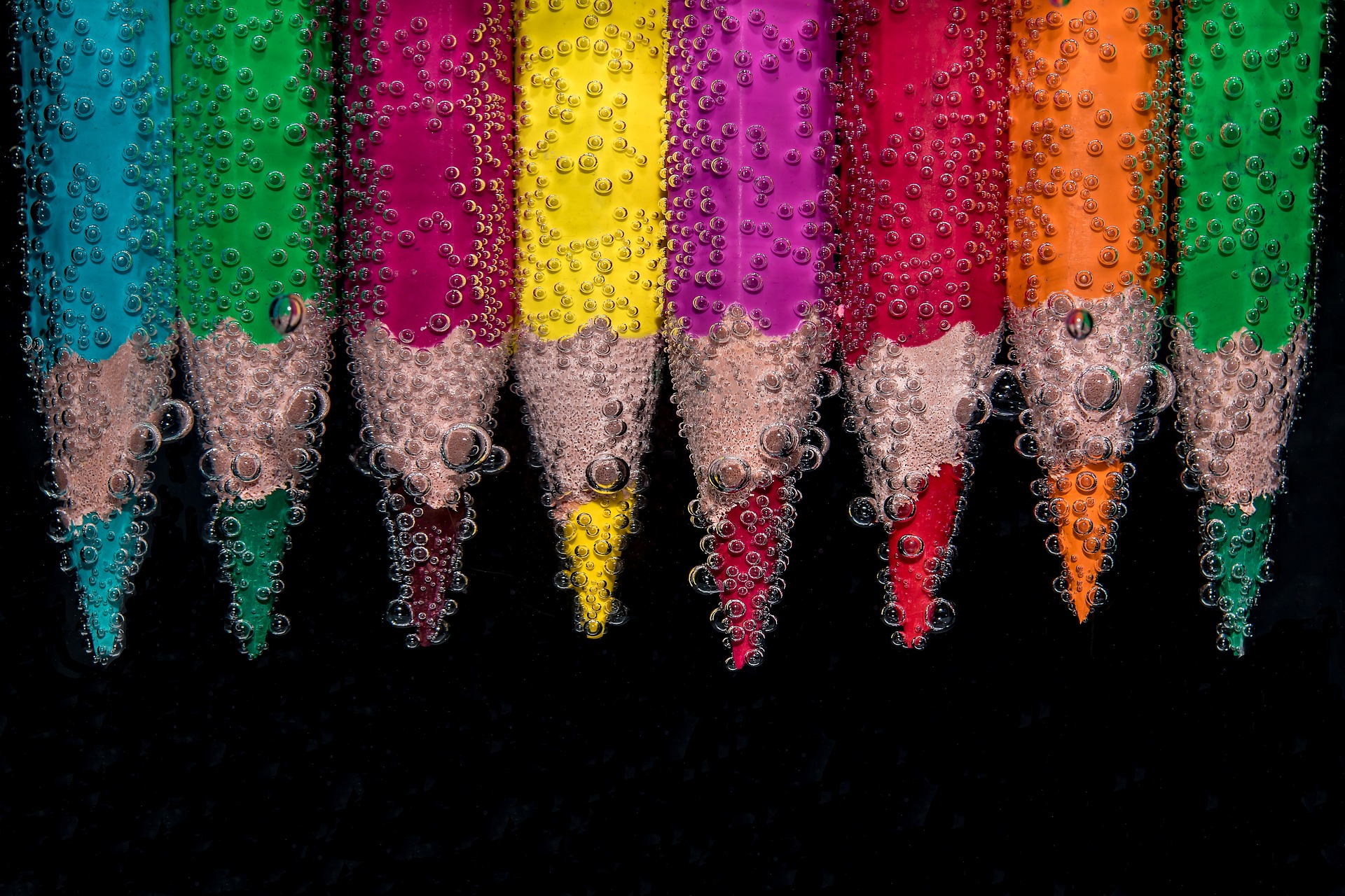
On the contrary, if a single person is expected to produce great ideas and thought provoking innovations, the colour green will fit the best. This is because green is known to be the colour that promotes harmony, thus boosting creativity. Red colour is best to be used in workspaces wherein employees have to work late into the night. This colour is known to increase brain wake activity, whereas orange is best for places of high-energy as it boosts enthusiasm. Yellow, on the other hand, is best for fast-paced places as it energizes the person, making them feel more active.
Thus, colours in workspaces greatly impact the way employees work. Each one of the colours have unique features that can be used in different areas of the workspaces. Colours can have many effects on employees including excitement, stimulates brain activity, tranquilizes and relaxes the brain, causes depression in certain circumstances, increase ones appetite and creates a feeling of extreme warmth or coolness. Colour is known to influence everyone universally.
Using combinations of different colours can be a great way of promoting feelings of confidence, productivity, energy and excitement to come to work. Psychology says that, people enjoy working in colourful environments rather than one tone environments. However, colours aren’t the only factor, textures can greatly affect people too.
What about the strength of the darkness or lightness of the colour of paint being used?
Well, yes, that matters just as much. Light walls make the space look bigger visually and dark walls usually make a room look smaller.
Read Solving the Biggest Problems in Commercial Interior Design.
If boring colours isn’t your thing, then white is most definitely isn’t what you should go for. Bright colours make a room look livelier and brighten up the living space. Different hues of colours have specific characteristics. Red is associated with high energy while pink is more flattering. Yellow gives a certain glow to the room, making it cheerful and brighter, but too much may reflect or cast light on the skin.
In order to decide which colours will go best with your surroundings, it is crucial for you to decide which main colours that you narrowed down to are. This will be solely dependent on whether you would like the colour to affect your mind, emotions, body or balance. Once that is done, you can now check the various hues of the main colours and go for the ones that will best suit your surroundings. You can choose from a highly saturated or lowly saturated hue.
Interestingly enough, colour is both scientific and personal.
The first thing you need to do is figure out which part you would like the colour to affect, once that is sorted, go with your gut feeling. It has been proven that people have different colours that makes them feel productive. Not every single person has the same thoughts about a certain colour.
Music and colour work in pretty much the same way.
There is no such thing as a “wrong colour”. Every colour has its own speciality that makes it different from every other colour. Tom might like white as he thinks it makes him more productive and less distracted, while Henry might think red works best for him. Not necessarily, every two people might have the same opinion. It solely depends on your personal preference and use of the colour that will help them in a certain way.
Need artwork for your workspace? Email me at donna@donna-stone.com.au so I can help bring colour to your area.